Less Is More: Why Luxury Brands Simplified Their Logos
Logos are a crucial aspect of branding that can make or break a company’s success. In recent years, there has been a noticeable shift towards more boxy, wordy, plain designs taking away the cursive fonts and elaborate sophisticated designs we are so used to with luxury brands.
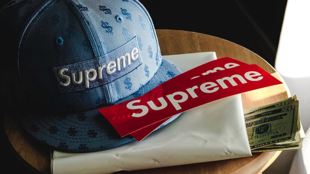
Have a look at the brand Supreme by James Jebbia, it is a luxury brand, albeit newer than old haute couture brands, it immediately hopped on the trend of boxy, simple logos and consumers loved it. Why the sudden in consumer demand and why are all the brands changing their logos?
Key Takeaways
- Digital media’s ease of logo creation has resulted in a surplus of unoriginal designs.
- Flashy logos in fashion face consumer backlash as symbols of excess.
- Brands must balance memorable logos with tasteful representation.
- Minimalism is trending in a world of excess
Why Luxury Logos Have Simplified | Culture
Luxury brands have simplified their logos partially due to cultural changes. The world has seen a lot of excess and many consumers are now becoming more socially conscious about being sustainable and less flashy.
In recent years, brands such as Gucci, Burberry and Balenciaga have been heavily criticized for their approach to branding and the way that they flaunt their logos prominently on their products which can make them appear cheap and tacky.
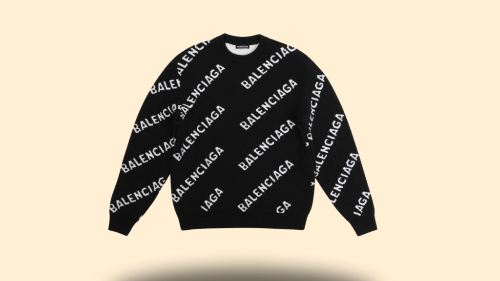
Not to mention, just logos on a sweatshirt or blouse makes it easy for fake manufacturers make fake goods that looks just like them, just without the hefty price tag.
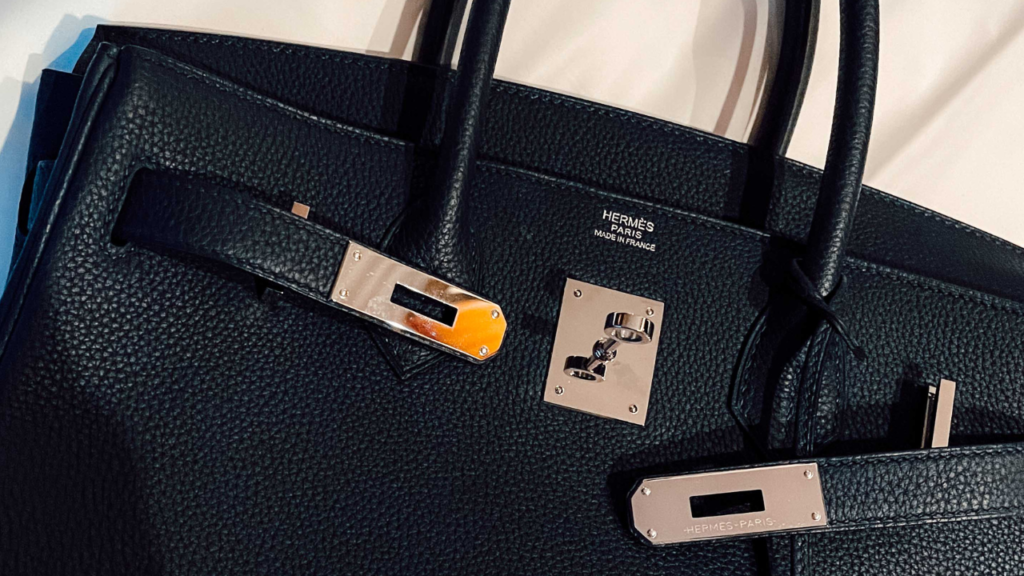
On the other hand, brands such as Hermes and Bottega Veneta have opted for a simpler logo on their products and focus much more on the quality rather than their branding. In fact, the logos are tiny and can barely be seen, instead they’ve focused on the crafting and design of the product that make it recognizable from across the street.
All of these brands have a clear mission and vision, and they champion creativity, talent, and taste, however social commentary has shown that people are steering towards more simplistic logos and brand cultures that focus on quality over quality.
A look at how luxury logos have evolved

Unfortunately, luxury logos do not stand out from the crowd anymore. They have been simplified even further than before and merged to use similar bold fonts, getting rid of cursives, flicks and personality. Whilst some may consider this unfortunate, it was inevitable and largely caused by the advances in technology.
To put it simply, cursive fonts are hard to read, and people easily feel disconnected from things they do not immediately understand. Small logos are even harder to read on smartphones, and in 2021, there were 3.8 billion smartphone users which is a number only expected to increase over time.
Social Media’s Impact On Logos
With the rise of Social Media, platforms like Facebook, Instagram, and Twitter, companies are now designing logos that are easily shareable and recognizable on social media.
Another factor contributing to the popularity of minimalistic designs is the emergence of 3D and gradient effects. These effects can add depth and dimension to an otherwise simple logo, making it more visually appealing without sacrificing its simplicity.
Google is a great example of a company that has optimized its logo for social media. The company’s logo is simple, recognizable, and easy to share on social media platforms. Google’s logo has become so recognizable that it doesn’t even need the company name to be identified.
Technology and social media have played a significant role in the evolution of logos. Companies are now designing logos that are optimized for mobile devices and social media platforms. With the rise of smartphones and social media, it’s no surprise that companies are now looking for ways to make their logos more visually appealing and recognizable on these platforms.
Minimalistic Culture Is On The Rise

Luxury brands always had the option to remain different and standout from the crowd with more cursive chic looking fonts and elaborate logos, however the middle income population in the world has expanded impacting who can buy luxury brands.
If luxury brands want to avoid looking as though they are only for the elite, instead by simplifying their logos, they leave their brand up for interpretation, resulting in a more relaxed atmosphere for new customers to enter the store.
Logos now feature clean lines, simple shapes and a limited color palette, most of which it is just black. This is because logos need to be easily recognizable across a variety of platforms and devices.
Consumers Thoughts On cheap Vs expensive logos
Many brands, including Gucci and Burberry, have redesigned their logos to be more bold and eye-catching. However, this trend has been met with criticism from some consumers who prefer a more understated and quiet luxury.
A cheap logo can create the perception that the brand is not serious or professional, while an expensive logo can create the perception that the brand is high-end and exclusive. A cheap logo can also make a brand appear less trustworthy, while an expensive logo can create the perception that the brand is reliable and trustworthy. In fact in 2023, Gucci suffered a 14% decline in reported revenues in the third quarter of the year and it just goes to show how Gucci’s maximalistic designs have not transferred well into the minimalistic understated trending fashion scene of the 2020s.
Specific Reasons why some companies changed their logo
Burberry
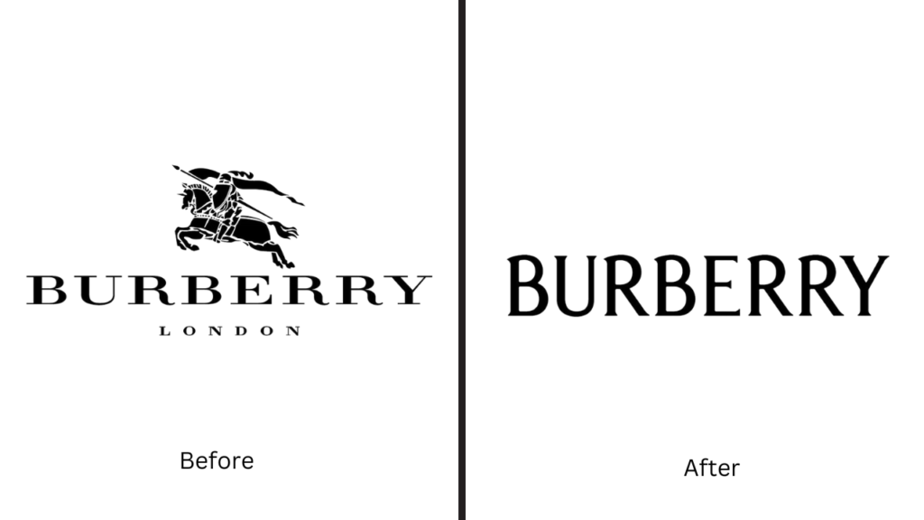
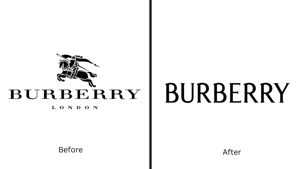
Burberry changed its logo to distance itself from its previous association with gang culture. Somehow, the logo of the equestrian knight became associated with gangs in the 90s to the point that pubs would reject people wearing burberry logos.
In an effort to change their image, their new logo features a sleek, modern font and a new monogram that replaces the old check pattern. The change was made to appeal to a younger, more fashion-conscious audience and to position the brand as a luxury fashion house.
Overall, there are many reasons why companies change their logos. Some companies change their logos to reflect changing market trends, while others change their logos to distance themselves from a bad reputation. Whatever the reason, changing a logo is a big decision that requires careful consideration.
Many social media companies changed their logos as well. At the forefront of technology, when they changed their logos, many other industries were incentivized to change theirs as well.
Meta (formerly Facebook)
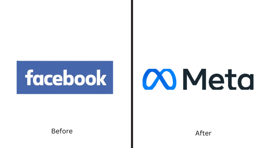
Meta, formerly known as Facebook, changed its logo to reflect its new focus on the metaverse. The new logo features a stylized infinity symbol, which represents the infinite possibilities of the metaverse. The change in the logo is part of a larger rebranding effort to position Meta as a company that is focused on the future of technology.
Apple
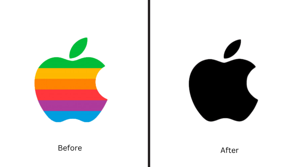
Apple’s logo has undergone several changes over the years. The company’s first logo featured a picture of Sir Isaac Newton sitting under an apple tree. However, this logo was quickly replaced by the now-iconic apple with a bite taken out of it. The reason for the change was to make the logo more simple and memorable.
Coca-Cola
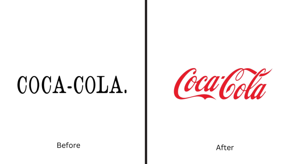
Coca-Cola has periodically updated its logo to stay modern and relevant, reflecting the company’s evolving brand identity and appealing to new generations of consumers. Oddly enough, they are one of the few brands that continue to use cursive font. These changes, while often subtle, aim to maintain the brand’s classic appeal while adapting to current design trends and consumer preferences, ensuring Coca-Cola remains a recognizable and cherished brand worldwide.
Best Buy
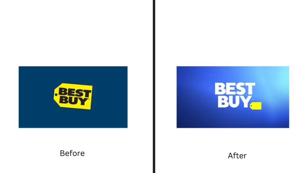
Best Buy changed its logo to simplify its branding and make it more readable. The new logo features a bold, blue font that is easy to read and stands out against a yellow background. The change was made to make the logo more modern and to reflect the company’s focus on technology.
What is driving the trend towards minimalist logo design?
Minimalist logo design is driven by a desire for simplicity and clarity. By stripping away unnecessary elements, minimalist logos are able to communicate a brand’s identity in a more direct and impactful way.
This trend is also influenced by the rise of digital media, where logos need to be easily recognizable across a variety of platforms and screen sizes.
How does the move to flat design impact brand identity?
Flat design is a style that emphasizes simplicity and minimalism by using clean, geometric shapes and bold, bright colors. This style has become increasingly popular in recent years, in part because it is well-suited to digital media.
While some argue that flat design can make logos look generic or indistinguishable from one another, others see it as a way to create a more modern, streamlined brand identity.
What are the cost implications of rebranding with a simpler logo?
The cost of rebranding with a simpler logo can vary widely depending on a number of factors, such as the size and complexity of the organization, the scope of the rebranding effort, and the level of expertise required to create a new logo.
In general, however, simpler logos are likely to be less expensive to design and implement than more complex logos.
How do minimal and flashy logos affect brand recognition and loyalty?
There is some debate over whether minimal or flashy logos are more effective at building brand recognition and loyalty. Some argue that minimal logos are more memorable and easier to recognize, while others believe that flashy logos are more attention-grabbing and can help to build a stronger emotional connection with consumers.
Ultimately, the effectiveness of a logo depends on a number of factors, including the specific goals of the brand and the preferences of its target audience.
