What’s The Color Palette Of Quiet Luxury? | Subtle Elegance
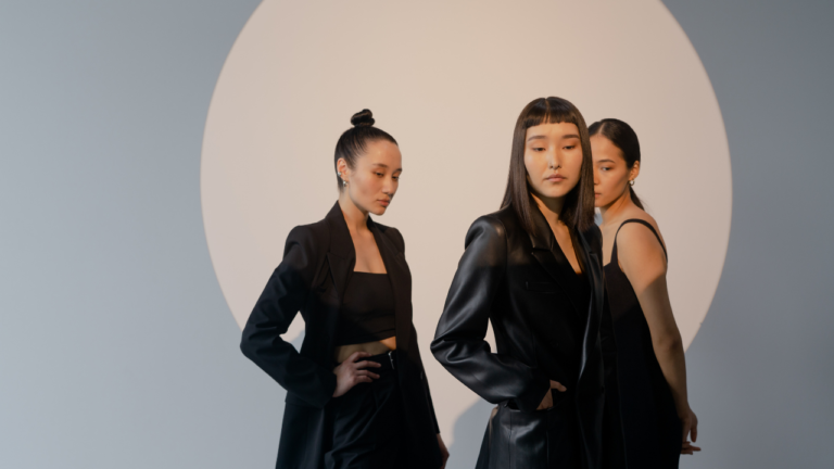
Quiet luxury epitomizes sophistication without the need for loud statements or flashy symbols of wealth. It is defined by muted tones and understated elegance, expressing a sense of luxury that is felt rather than flaunted.
Colors play a key role in crafting this aesthetic, where the palette is purposefully selective to evoke tranquility, timelessness, and a seamlessly harmonious environment that remains effortlessly luxurious.
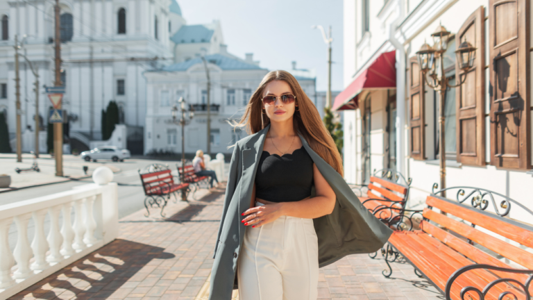
Be it through fashion, home style or jewellry, we’ve created a simple cohesive color palette that can help you achieve the refined quiet luxury look throughout your life easily.

The color spectrum for quiet luxury is carefully curated to include shades that are both versatile and rich in subtlety. These hues typically include deep, resonant colors as well as soft, neutral tones that together, create a refined visual harmony.
Colors such as a deep midnight blue or a sophisticated charcoal grey often serve as anchors in this palette, while soft ivories and muted olives provide a complementary softness and may even serve as sophisticated backdrops that enhance other design elements.
Key Takeaways
- Quiet luxury colors represent understated elegance and sophistication.
- The palette includes deep tones and soft neutrals for balance.
- These colors create a cohesive and serene environment that emanates luxury.
Characteristics Of Quiet Luxury Color Palette

In exploring the quiet luxury color palette, you’ll uncover a world of understated elegance that prioritizes sophistication and minimalism. These aspects define a style that speaks volumes through subtlety and refined tastes.
The Core Principles
Serenity: You will find that colors in the quiet luxury palette exude a soothing effect. These hues are typically muted, such as soft ivories, delicate creams, and understated grays which nurture a calm and luxurious atmosphere in any setting.
Versatility: Unlike more vivid color schemes, quiet luxury shades such as navy blue and olive green complement a wide range of other colors, promoting a harmonious blend that stands the test of time.
Natural Elegance: Colors inspired by nature, including chocolate brown and charcoal gray, are staples in the quiet luxury palette. These colors align with luxury as they lend an organic richness to the environment around you.
Subtle Depth: Quiet luxury doesn’t shy away from depth, as seen in the midnight shades that offer an alternative to black. These deeper tones add complexity whilst maintaining the aesthetic’s characteristic discretion.
Quiet Luxury vs. Conventional Luxury
Conventional luxury is the complete opposite of quiet luxury so we need to know exactly what to avoid and how to pick the right pieces for our home and wardrobe. Here are differences that you should take note of if you’re trying to achieve a quiet luxury look:
Color Intensity: Conventional luxury oftentimes embraces bold, vibrant colors that command attention. Quiet luxury, in contrast, opts for subtler tones that underpin an air of mystique without the need for saturation.
Manifestation of Opulence: In quiet luxury, your environment whispers affluence through minimalistic hues that allow the quality of materials and workmanship to take the foreground. This differs from conventional luxury’s more direct expression, which can be louder and more ornate.
Timelessness: The palette for quiet luxury leans towards colors that stand the test of time. Earthy neutrals and soft pastels provide a foundation that remains sophisticated through changing trends, unlike the conventional luxury that may hinge on the color du jour.
The Quintessential Colors of Quiet Luxury

Quiet luxury style emphasizes understated elegance through a specific color palette that enhances a timeless and sophisticated aesthetic. Embrace these colors in your wardrobe or interior design choices to exude a subtle, refined presence.
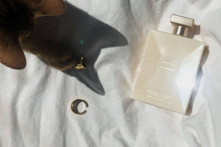
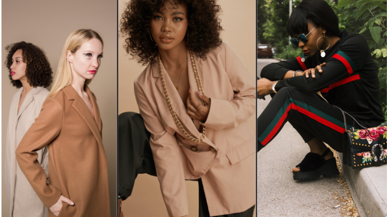
Neutral Tones: beige, ivory, soft white
In the realm of Neutral Tones, you’ll find that shades like beige, ivory, and soft white become foundational. These hues offer a clean, calming base, working seamlessly with various textures and styles to create a serene and luxurious setting.
- Beige: A versatile backdrop, it pairs well with richer colors for depth.
- Ivory: Brighter than cream, providing a light, yet warm, elegance.
- Soft White: A purer alternative to stark white, delivering a gentle refinement.
Soft Pastels: pale pink, baby blue, lavender
Soft Pastels are key in crafting a gentle and sophisticated quiet luxury palette. Pale pink adds a touch of warmth, baby blue provides a breath of tranquility, and lavender introduces a whisper of nature’s serenity.
- Pale Pink: A subtle infusion of color that remains understated.
- Baby Blue: Its airy vibe complements the quiet luxury aesthetic.
- Lavender: Brings a unique, soft touch that’s both comforting and chic.
Earthy Hues: olive green, terracotta, muted gold
Earthy Hues like olive green, terracotta, and muted gold ground the quiet luxury palette with their natural, subdued richness. These colors resonate with quiet confidence and an organic appeal.
- Olive Green: This subdued color anchors your attire or decor in nature’s palette.
- Terracotta: Offers a warmer, earthly essence without overwhelming.
- Muted Gold: Suggests a hint of opulence without the ostentation.
Subdued Metallic Accents e.g., brushed silver, matte gold
Finally, your quiet luxury palette welcomes Subdued Metallic Accents. Think brushed silver and matte gold—metals that provide a luxe finish without the high-shine of traditional metallics.
- Brushed Silver: It’s less reflective, fostering an elegant, modern feel.
- Matte Gold: With its soft luster, it conveys affluence in a tasteful manner.
Maintaining Balance and Cohesion

When selecting colors from the quiet luxury palette, your aim should be to achieve a harmonious balance that resonates with sophistication. Combining Colors is less about a random mix and more about a thoughtful blend that elevates your space.
- Navy Blue: This deep color is a sumptuous alternative to black that complements other luxurious hues, ranging from ivory to chocolate brown.
- Gray-Green: A subtle hint of color that adds depth and tranquility to any room.
When you are mixing these hues, remember to consider the weight of colors in your combinations. Balance darker shades like navy with lighter tones to avoid heaviness.
Textures and Materials play a pivotal role in enhancing the quiet luxury feel. To bring out the best in your color palette, incorporate:
- Soft Ivory: Utilize natural fabrics like linen or silk in this shade to add a layer of understated elegance.
- Metallic Accents: Use brushed gold or silver to accentuate elements without overpowering them, as they provide a sophisticated edge.
Some Other Colors to think about topPersonalization of your space are:
- Dusty Blue: Perhaps a personal favorite, can serve as a serene backdrop or a charming accent.
- Muted Olive: A versatile choice that can subtly play into your overall aesthetic.
Embrace these elements confidently, allowing them to enhance the quiet luxury aesthetic while making it uniquely yours. Remember, it’s your personal touch that transforms a space from simply stylish to truly luxurious.