Harmony at Home: Calming Color Scheme Secrets
To make our living spaces feel truly cozy and inviting, it’s essential to pick just the right color scheme that brings relaxation and warmth. For example, one of the reasons we feel calm in a hotel is because they choose relaxing colors that boost our mood the moment we walk into our room.
Calming colors really enhance the visual appeal of our rooms which has a positive impact on our mood and well-being. Let’s learn what the most soothing colors are for every room in your house, drawing inspiration from nature and personal preferences.
Choosing Calming Color Schemes for Your Space: Expert Tips and Ideas
Various shades of blue, green, and even muted tones like taupe can evoke a sense of tranquility and comfort, making them ideal choices for designing a serene space. For example, pale blues and aquas have a calming effect, while warmer tones like taupe can add a cozy touch to any room (Better Homes & Gardens). By experimenting with these restful hues, we can create cohesive and balanced interiors that promote relaxation and enhance our overall sense of well-being.
It’s important to remember that personal preferences play a significant role in finding the perfect calming color scheme. Some may find solace in pastel shades, while others might prefer more earthy tones. Whichever palette you choose, ensure that it aligns with your unique tastes and brings a sense of harmony and tranquility to your space. Stay tuned as we delve deeper into specific colors, their effects, and how to incorporate them into your home’s design.
Understanding Color Psychology
When it comes to designing a calming space, understanding color psychology can be a useful tool. By knowing how different colors affect our moods and emotions, we can make informed decisions about choosing the most soothing color schemes for our rooms.
Color and Mood
Colors have a profound impact on our moods and emotions. Research has shown that some colors can evoke feelings of warmth and comfort, while others can create a sense of calm or even sadness (Verywell Mind). It’s essential to consider the mood we want to create in a space when selecting colors for our interior design.
Effects of Different Colors
Let’s explore the psychological effects of various colors and how they can contribute to a calming environment:
- Blue: This color is known for creating a sense of calm and facilitating focus. It is often used in workspaces to encourage productivity and concentration.
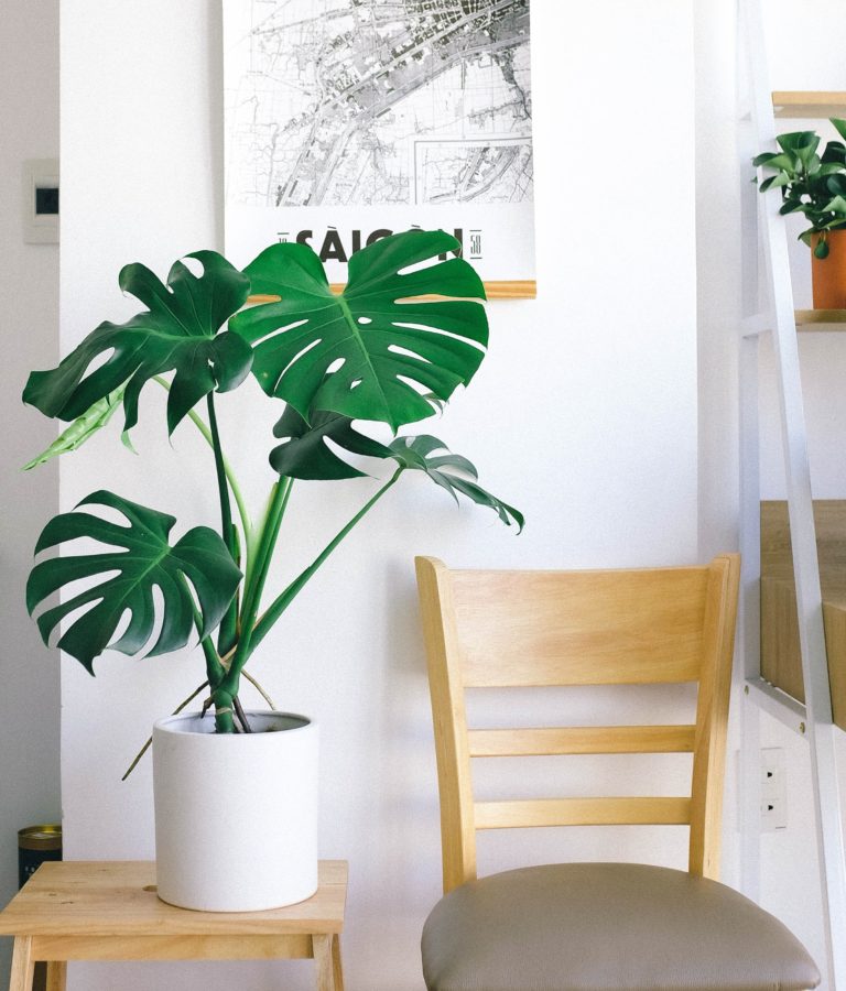
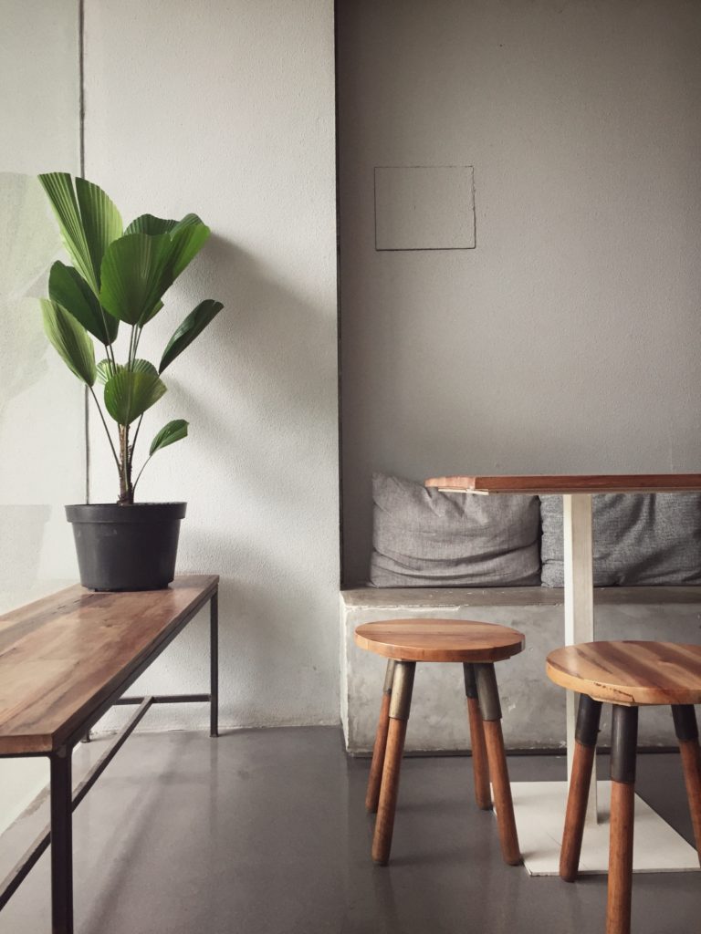
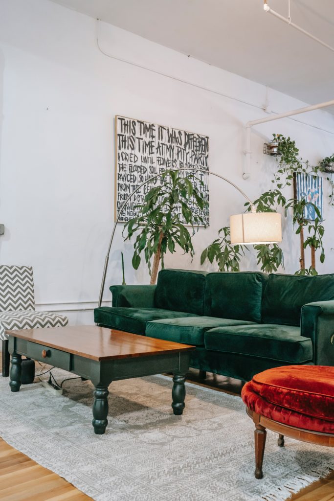
- Green: Evoking feelings of nature and serenity, green is an excellent choice for creating a soothing atmosphere. It can also help reduce anxiety and promote relaxation
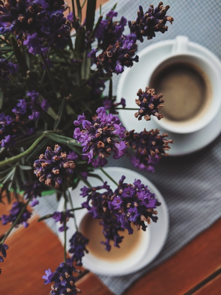
- Purple: Depending on the shade, purple can be calming or energizing. Lighter tones such as lavender can create a peaceful environment, while darker tones add a touch of luxury and drama
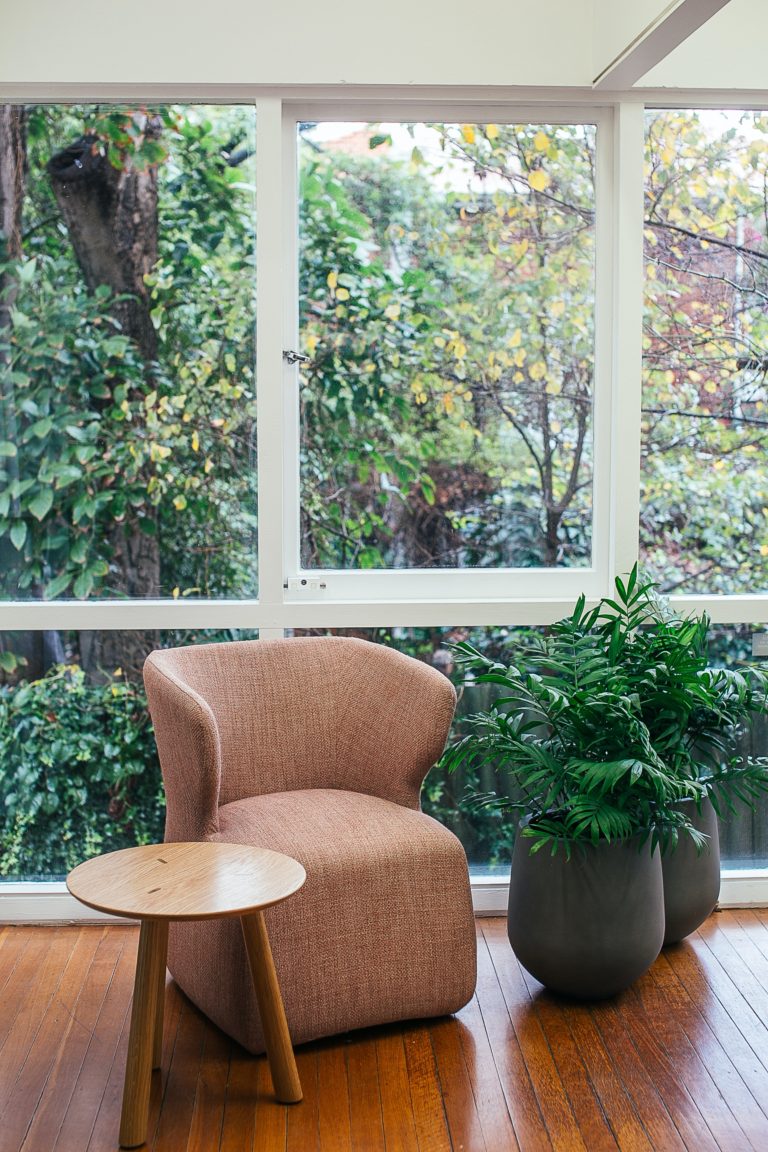
- Gray: A versatile neutral, gray can provide an elegant and understated backdrop for other calming colors. It can also create a sense of calm when used as the primary color in a room
- White: Associated with purity and simplicity, white can make a space feel open and airy. It can be an excellent choice for small rooms, but make sure to add touches of color to create visual interest and warmth
When selecting colors, consider the room’s function and desired atmosphere. For example, blues and greens are ideal for creating a peaceful bedroom, while a blend of gray and white might be perfect for a minimalist living room.
Remember to explore different shades and combinations to find the right balance for your space. As a general rule, incorporating both lighter and darker tones can add depth and character to a room, while using too many bold colors might overwhelm the calming effect.
Identifying Your Personal Preferences
When choosing calming color schemes for our spaces, it’s important to take our personal preferences into account. The colors that soothe one person may feel entirely different to another. In this section, we will discuss factors to consider when identifying our personal preferences, such as our lifestyle and the characteristics of our space.
Consider Your Lifestyle
First, we need to consider our lifestyle and how it impacts our personal preferences. For example, if we are constantly surrounded by noise and chaos, we might gravitate towards colors that evoke a sense of tranquility and calmness. On the other hand, if our days are usually quiet and peaceful, we may prefer bolder colors that add energy and excitement to our space. Begin by reflecting on the atmosphere we’d like to create in our home and how certain color schemes contribute to that atmosphere.
Evaluate Your Space
Next, we should assess the characteristics of our space to help guide our color choices. When evaluating our space, it’s important to consider factors such as natural lighting, room size, and furniture style. For example, rooms with limited natural light may benefit from lighter color schemes, such as pale blues or silvery sky-blues, which can enhance the feeling of calmness and relaxation (Better Homes & Gardens). Similarly, larger rooms might require bolder colors to create a more intimate and cozy atmosphere.
In addition to these considerations, we should be mindful of the existing colors and textures in our space. For a harmonious and calming effect, try to choose a color schemes that complements the elements already in the room, such as the furniture or accessories.
Choosing a Color Scheme
When it comes to creating a calming and relaxing atmosphere in your space, selecting the right color scheme is crucial. In this section, we’ll discuss three approaches to designing a harmonious color scheme: monochromatic, analogous, and complementary.
Monochromatic Schemes
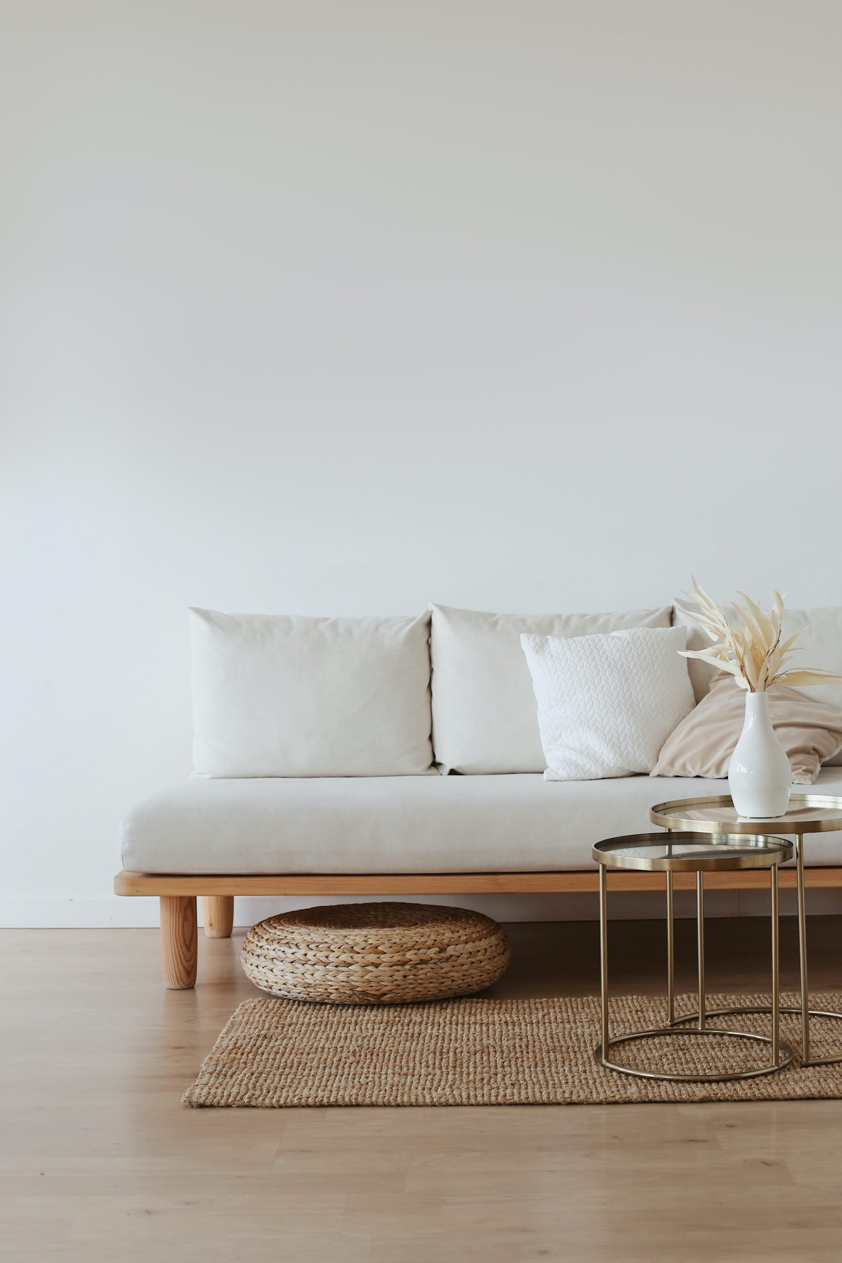
A monochromatic color scheme is based on a single color, with varying shades, tints, and tones of that color used throughout the space. This approach creates a cohesive and harmonious atmosphere. To ensure visual interest, it’s important to play with different textures and materials within the same color family. For example, if you choose a pale blue as your base color, incorporate pale aqua or silvery sky-blue linens, cotton sheets, velvet pillows, and wool blankets for a calming effect (source).
Analogous Schemes
An analogous color scheme consists of colors that are adjacent to each other on the color wheel, creating a harmonious and soothing environment. To design an analogous color scheme, start by picking your base color, then select two or three neighboring colors on the color wheel. For example, if you choose a soft green as your base color, you could incorporate pale blue and light yellow accents. It’s important to balance the intensity of the colors, using more subtle shades for larger areas and brighter tones for accents.
Complementary Schemes
A complementary color scheme pairs colors that are opposite each other on the color wheel, providing visual contrast and balance. Although this approach can create a lively and energetic atmosphere, using softer versions of the complementary colors can evoke a sense of calm and relaxation. To implement a complementary color scheme, select two colors that are opposite each other on the color wheel, then incorporate various shades, tints, and tones of those colors in the space. For example, pair a soft blue with a muted orange for a balanced and calming color palette.
Regardless of the color scheme you choose, remember to consider the size of the room, the color you choose can make it feel more spacious or intimate. Above all, ensure that the colors you select make you feel calm and relaxed in your space.
Popular Calming Colors
When designing a calming space, certain color schemes have been known to evoke a sense of relaxation and serenity. In this section, we will explore popular calming colors in three categories: cool colors, neutral colors, and soft warm colors.
Cool Colors

Cool colors, such as blues and greens, can create a soothing atmosphere in your space. Think about how the sky looks when it’s clear and peaceful. For example, pale aqua or silvery sky blue can make a room feel tranquil and peaceful. Or Forest deep, dark greens also offer comfort when combined with yellow or golden highlights in dimly lit rooms. Here are some cool colors to consider:

- Pale aqua
- Silvery sky-blue
- Deep, dark green
Neutral Colors
Neutral colors can provide a sense of calm without making your space feel too cold or stark. Grays and other neutrals with a hint of color help us feel comfortable in our surroundings. A popular neutral calming color is Benjamin Moore’s Gray Owl, which reads as barely blue on walls and works well with both gray and blue color schemes (Better Homes & Gardens). Here are some neutral colors to consider:
- Benjamin Moore’s Gray Owl
- No Filter by Clare (ELLE Decor)
- Light Beige
Soft Warm Colors
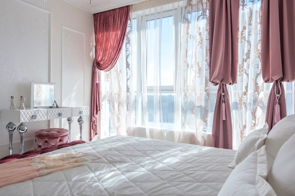
Last but not least, let’s explore soft warm colors that can create a sense of warmth and security while still promoting relaxation. Soft pinks, for example, have been increasing in popularity for their sweet and comforting nature (ELLE Decor). Here are some soft warm colors to consider:
- Soft pink
- Peach
- Buttery yellow
Implementing Your Color Scheme
Once we’ve chosen our calming color scheme, it’s time to incorporate it into our space. In this section, we will discuss how to make the most of our selected colors by focusing on three key aspects: selecting paint and wallpapers, balancing furniture and decor, and incorporating textures and patterns.
Selecting Paint and Wallpapers
When selecting paint or wallpaper, consider colors that evoke feelings of relaxation and calm. Subtle, undemanding colors can help achieve this ambiance. Some examples of calming paint colors include soft gray blues and soothing neutrals. For wallpapers, look for patterns that complement the chosen color palette without being too busy or overwhelming.
It’s easier to add texture using furniture, throws, and carpets later than changing your wallpaper later on. Remember the essentials of a space such as color, pattern, and texture help to create a serene atmosphere in the space.
Balancing Furniture and Decor
With the walls painted or covered in wallpaper, we can move on to selecting furniture and decor. It’s essential to be mindful of our chosen color palette, ensuring that the pieces we incorporate into the space complement and enhance our calming color scheme.
Stick to a small range of hues and avoid overly bold or bright pieces that may disrupt the tranquil atmosphere. Mix and match various colors within the chosen palette, layering in lighter and darker shades for a sophisticated, cohesive look.
Incorporating Textures and Patterns
Textures and patterns play a crucial role in making a space feel cozy and visually interesting. Incorporate different textures through soft furnishings like throw pillows, blankets, and area rugs. These will add warmth and comfort while contributing to the calming atmosphere.
When incorporating patterns, keep them subtle and in line with our color palette. Geometric patterns, simple florals, or organic shapes can work well to enhance the calming effect without drawing too much attention away from the overall color scheme.
In conclusion, by carefully selecting paint and wallpaper, balancing furniture and decor, and incorporating textures and patterns, we can effectively create a calming atmosphere in our space that promotes relaxation and well-being. Remember to strike a balance between color, pattern, texture, and maintain a cohesive color palette throughout the design process.
Conclusion
Achieving harmony at home through calming color schemes involves carefully selecting colors that evoke tranquility and well-being, blending them seamlessly to create a serene and cohesive living space.
We hope that highlighting these calming color schemes has inspired you to transform your living space into a peaceful haven. Remember to take into account the theme you want to achieve, the size and lighting in your room, and your personal preferences when making your choices.
Don’t hesitate to experiment with various hues, such as pale aqua or silvery sky-blue, soothing shades of blue-greens and soft grays, or even darker tones like dark gray. The key to success lies in selecting colors that evoke relaxation and positively impact your mood.
Lastly, don’t forget to complement your chosen color scheme with appropriate textures, patterns, and decorative elements. This will further enhance the calming effect and create a harmonious atmosphere in your space. With thoughtful planning and a creative approach, we’re confident that you can design a serene and inviting environment that you’ll love to come home to.