Why Does Hermès Use The Color Orange? Iconic Branding
Hermès, the luxury fashion brand, is famously known for its iconic orange color, also known as, Orange H or Hermès Orange. The brand’s signature orange hue can be seen on its packaging, shopping bags, and product designs. You can instantly tell the moment someone bought an Hermès product. Their iconic bright orange hue shopping bags are so striking and eye catching that you begin to wonder what this person possibly bought from Hermes. Was it a Birkin? An Orange Oran sandel?
Hermès’ orange is so iconic that it is instantly recognizable around the world but how did this colour come to be associated with the luxury brand? Why did Hermès decide to use this color?
You Can Clearly see how Hermès orange is highlighted throughout the Instagram Reel
The history of Hermès orange can be traced back to the 1930s when the brand introduced its first leather handbag, the Haut à Courroies. The bag was designed for horse riders and was made of durable leather, which was dyed in a bright orange hue. This color was not only practical for equestrian purposes but also caught the attention of the fashion world. Since then, the color orange has become synonymous with the brand, representing its heritage, craftsmanship, and luxury.
Key Takeaways
- Hermes introduced its iconic orange color in the 1930s with the launch of its first leather handbag, the Haut à Courroies.
- The color orange represents the brand’s heritage, craftsmanship, and luxury.
- Hermes uses the color orange strategically in its branding, marketing, and product design to create a strong brand identity.
The History of Hermès’ Orange
Early Beginnings and World War II
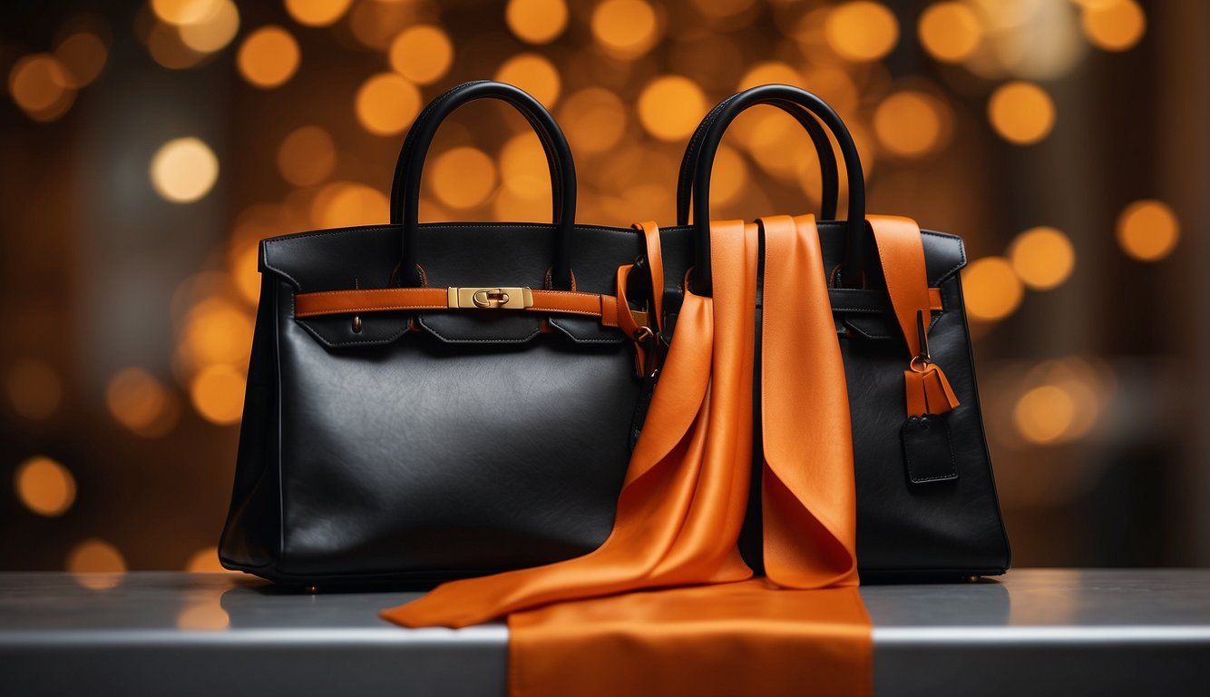
In the 1920s, Hermes packaging was designed to resemble pigskin in a cream shade with a gold foil logo and edging. However, during World War II, shortages struck Europe, and Hermes had to find a new material to use for their packaging. They settled on a rich mustard or marigold yellow with dark chocolate brown edging and logo, which became the signature Hermes orange. The color was a practical choice as it was made from a natural dye that was readily available at the time.
Evolution of Hermes Orange
Overtime the orange color became synonymous with Hermes, as the company began to use it across all their products. You can find iconic Orange H Hermès across their product lines, in their Birkins, Kelly Wallets, Silk Scarves, Oran Sandels and more.
The color has also evolved over time, stabilizing after the 1960s to what we know now. Hermes has been known to use color to shape its brand identity and preserve its heritage, and the orange color is one of the most recognizable colors in the industry.
Emile-Maurice Hermes, the grandson of the founder of Hermes, was a pioneer in color branding. He believed that color was an important tool in creating a brand identity and used it extensively in Hermes products. The color orange was chosen for its vibrancy, warmth, and energy, and it has since become a symbol of the brand’s luxury and elegance.
It was a practical choice made during World War II, but it has since become an iconic color that is synonymous with the brand. Emile-Maurice Hermes’ vision for color branding has helped shape the brand’s identity, and the orange color remains an important part of that identity today.
Significance of the Color Orange
Psychological Impact
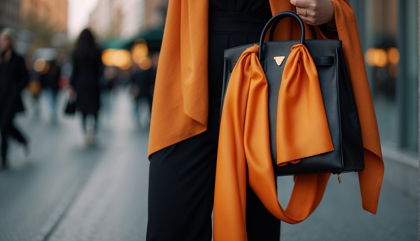
The color orange is known to have a significant psychological impact on individuals. It is associated with optimism, energy, joy, creativity, and enthusiasm. The color is believed to stimulate the brain and increase mental activity. It is also known to enhance social communication and promote feelings of warmth and happiness. These psychological effects make the color orange an ideal choice for brands that want to convey positivity and energy.
Cultural and Fashion Relevance
The color orange has cultural and fashion relevance, especially in Europe. In the Netherlands, for example, the color orange is associated with the Dutch royal family, and it is a symbol of national pride. In Ireland, the color orange is associated with the Protestant community and is a symbol of the Orange Order. In fashion, the color orange is often used to create bold and vibrant designs. Many designers have used the color to create eye-catching pieces that stand out from the crowd.
For Hermes, the company chose the color because it represents joy, creativity, and enthusiasm, which are values that the brand wants to convey to its customers. The color also represents the company’s commitment to craftsmanship and quality.
Hermes Orange Contributes To Brand Identity

The Hermes logo is a symbol of the brand’s commitment to quality and craftsmanship, and they take this very seriously. Hermès has actually trademarked Hermès Orange Hermès in the United States and France, and they have tried to do it in several other countries but some did reject the trademark such as Japan.
This is especially important for luxury brands as they are often subject to many copycat brands who try to dupe their bags and sell it for cheaper. Some customers willingly buy these dupes, however it is bad when customers unknowingly buy a product thinking it is a Hermes product. This is why authenticating Hermes scarves and bags is such a valued skill in today’s world.
The Iconic Orange Packaging

Hermès packages all of their products in Hermès Orange in high quality packaging making it feel luxurious and helps consumers believe that their brand is to be trusted. The orange boxes are made of high-quality materials, and they are carefully crafted to ensure that the products inside are protected during shipping. The boxes are also designed to be reusable, and many customers use them to store their Hermès products or as decorative items.
The finishing touch on the Hermès orange box is the Bolduc ribbon. The ribbon is named after the French word for ribbon, and it is a signature element of the brand’s packaging. The ribbon is made of silk, and it is tied around the box in a way that is both functional and decorative.
The ribbon serves a practical purpose by keeping the box securely closed during shipping. It also adds a touch of elegance and sophistication to the packaging. The design of the ribbon has remained largely unchanged over the years, and it is now an integral part of the Hermès brand.
Historical Context of Color Changes
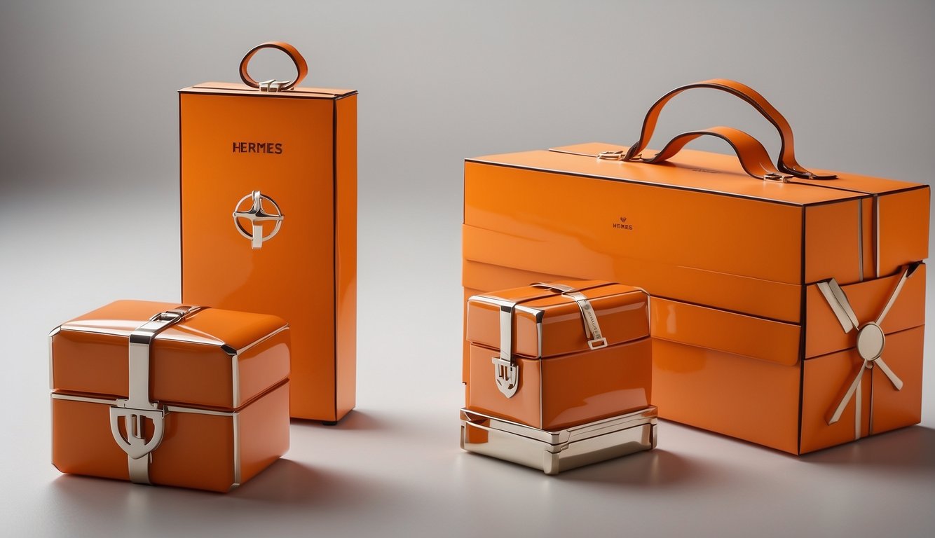
The evolution of Hermes’ color palette is not just a matter of aesthetics. The brand’s color choices are often influenced by historical events and cultural trends. For example, during World War II, Hermes was forced to use cheaper dyes, which resulted in a darker shade of orange. This period of grief and disappointment was reflected in the brand’s packaging, which was more subdued and less vibrant than in previous years.
Despite these challenges, Hermes continued to innovate and experiment with its color palette. Today, the brand’s classic orange is recognized around the world as a symbol of luxury and sophistication.

